Recently, in the world of healthcare IT, there has been an increased focus on the usability and design of EHR systems. From the American Medical Association's declaration on the need for an "Action Plan" to improve EHR systems, citing "clunky menus" and "cluttered screens," to the 2013 large-scale survey of medical doctors that found that "the current state of EHR technology significantly worsened professional satisfaction."
Fueled by federal mandates, the emergence of big data, aging populations, and the pervasiveness of chronic diseases, the global healthcare analytics market is expected to reach $20.8 billion by 2020, according to IQ4I Research & Consultancy, but meaningful use of analytics to improve quality of care and organizational efficiency is contingent on an accessible user-friendly interface. How can "users" find their way back into the "user experience"?
Paths to a new UI
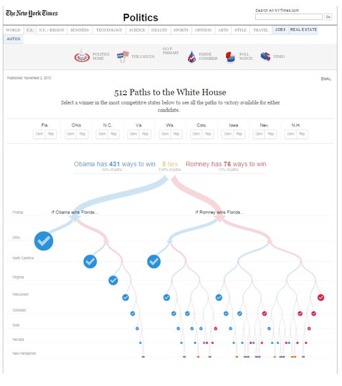
In 2012, the New York Times launched 512 paths, a visualization of all possible scenarios related to the 2012 election. Combining data and simulations from polls, the visualization would allow the user to see every "path" that lead to an election result manipulating each battleground state. Needless to say it went way beyond Tim Russert's famous whiteboard. This expression of possible election paths embodies what we need in healthcare – the simplification of hundreds of data points, the simulation of interventions and critical events and the interactivity to allow a user full understanding of the outcome.

Source: New York Times
Instead of poll and Electoral College data, consider the implications of slicing and dicing the data representing a patient population. Each path would represent trips to emergency rooms urgent care and primary care, or preventative care measures. Each path could be affected by outreach, education or other medical interventions. Isn't that the promise of EHR data?
Over the last three years, user interfaces have been revolutionized to be more intuitive and powerful, as well as more accessible and universal. And perhaps most importantly, they're free.
Future developments and implications of UX can be best understood through a discussion of a few tools that have the potential to significantly improve the user experience for healthcare professionals.
d3.js
Harken back to the 512 paths visual from the top of the page. It's a truly beautiful figure, both in terms of the use of visual cues, as well as a highly effective use of interactive elements to engage the user, and the d3.js visualization library facilitated its creation.
Designed by Mike Bostock, Jeff Heer and Vadim Ogievetsky, and principally maintained by Bostock, d3.js (D3 stands for Data Driven Documents) makes use of a number of standard web architectural elements (Javascript language, SVG objects, CCS layouts, and HTML5 core technology, to name a few) to produce consistent and highly controllable visuals.
The power of d3.js lies both in an accessible application programming interface (API)--
even users unfamiliar with graphical concepts can pick it up--as well as with its' devoted user base that continues to develop and document new uses for the language. With each visualization, whether for a school project or front-page figure, the user base becomes ever more enabled to develop sophisticated, interactive figures.
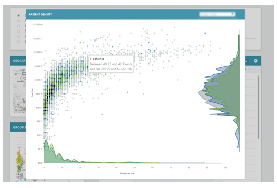
For these reasons, d3.js offers a great deal to those developing user interfaces in the healthcare space. For example, consider the following visual display:

Here we see each patient of a provider's panel plotted along with their total cost of care and number of events where they interacted with the health system. Interactively, users can compare the outcomes of one patient panel against others (or the organization mean), and most importantly, drill down to the exact patient that contributes this cost.
Although the visualization doesn't model every path outcome, it is getting close, and, more importantly, it does so in a way that can be adapted to user needs, rather than the opposite.
AngularJS
AngularJS is one of the latest model-view-controller (MVC) frameworks that are powering dynamic web interfaces. Consider MVC as an architecture in which you can simply design the thing you're describing (model), what it looks like (view), and what happens when the user interacts with it (controller), and then lets the framework handle all the work of actually creating the pages, forms, and transitions.
Angular helps bring the data structures presented by a data warehouse directly into Javascript, a commonly used and well-accepted language for web site design. In this way, Angular is now powering new, innovative visualizations with advanced filtering to slice and dice data across multiple groupings.
Angular also simplifies the process of loading, filtering and analyzing data across multiple factors. Imagine a typical longitudinal patient report, with CPT codes, DRGs, HCCs, rendering facilities, places of service, ICD-9 codes, PCP assignments, and more. Now imagine 10,000, 100,000, or 1M such rows. With Angular, one module can cross-analyze all of these datasets, each using different quantitative techniques and complex visualizations.
Most importantly, the user experience is preserved even as the process scales up in size. Since the Angular framework seamlessly loads data in the background, latency is reduced, allowing the developer to focus on prioritizing elements according to the desired user experience, rather than at the whim of the network connection or browser.
There are other mechanisms for developing beautiful visuals, some more powerful and perhaps better supported. The key is that anyone who has an idea of how to better visualize healthcare information should be able to take a hand at it. Tools like d3.js and Angular make this possible.
Focusing on user experience
In the last few years, extremely powerful, fast, intuitive and beautiful interfaces have become more and more commonplace.
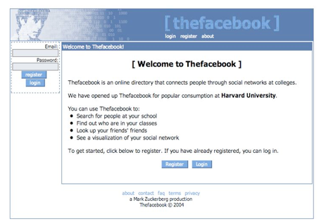
There is no good reason why users in the healthcare domain – physicians, nurses, medical assistants, administrative staff, leadership, and, yes, patients – shouldn't have the same expectations. If Facebook still looked like it did when it was "thefacebook", there would be far fewer 'likes.'

Source: thefacebook.com, circa 2004
The user interface and user experience is a big reason why very few users are 'liking' most healthcare business platform tools. When a patient is in a provider's office receiving medical care, the most technologically intuitive interface shouldn't be their iPhone, but rather the technology at their provider's fingertips supporting the documentation of their care. That same technology should also be at the ready to help their care team, as well as all of us interested in improving patient care, to make more effective use of patients' healthcare information in the delivery of their care.


